The Prometheus Team has just announced Prometheus version 3.0 at PromCon, with an official blog post detailing all the exciting new changes and features. A very visible highlight of Prometheus 3.0 is its new web UI that is enabled by default.
I've worked on this complete UI rewrite over the last half year or so and am excited to finally see it in the hands of users. In this post, I'll take a closer look at my motivation for building the new UI and then explain what it brings in terms of features and stability caveats.
Why a new UI?
I initially started building Prometheus' previous UI in 2019 as my first React app ever. It uses an outdated version of the Bootstrap CSS framework for styling and has accumulated a lot of uncoordinated cruft, visual clutter, and overpowering colors over the years.
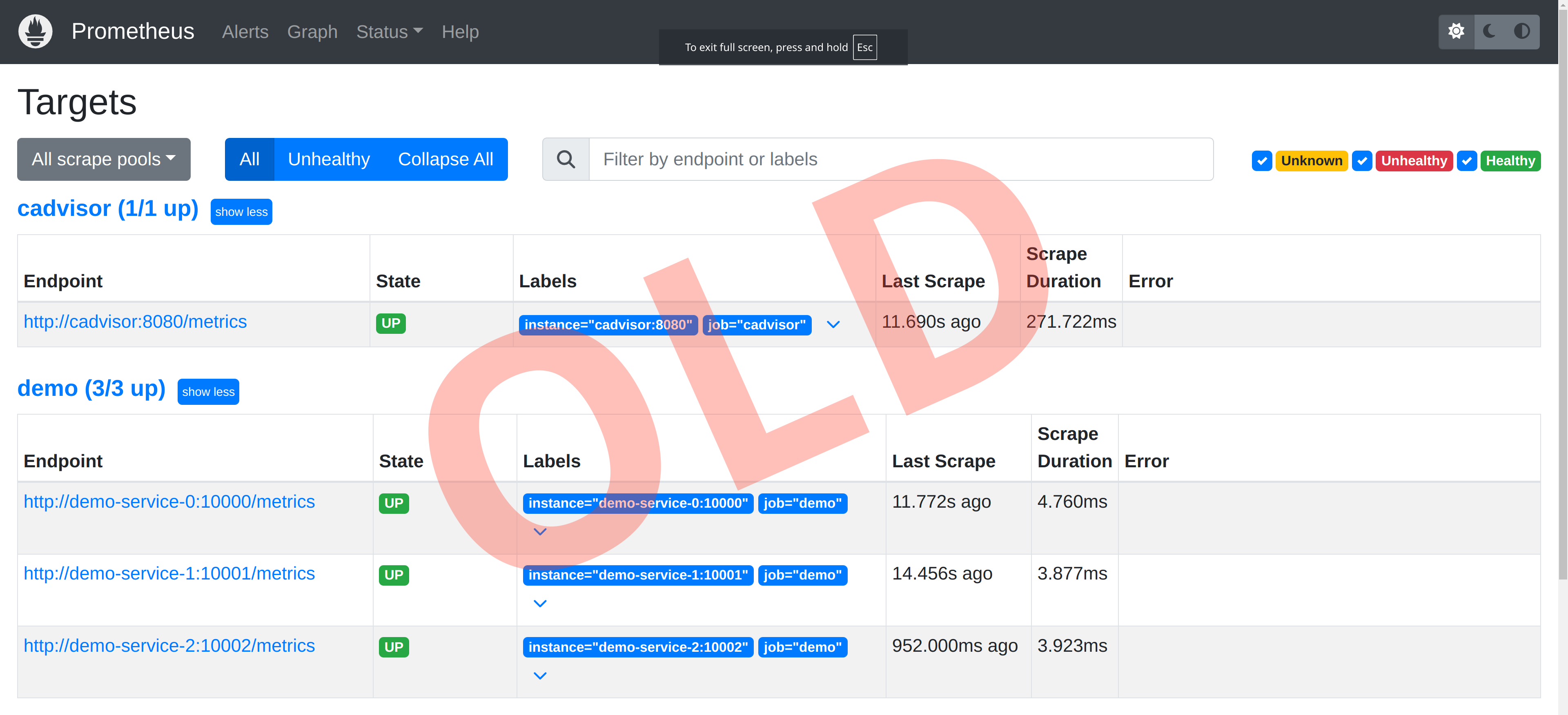
As a drastic example, take a look at the filters at the top of the old /targets page:
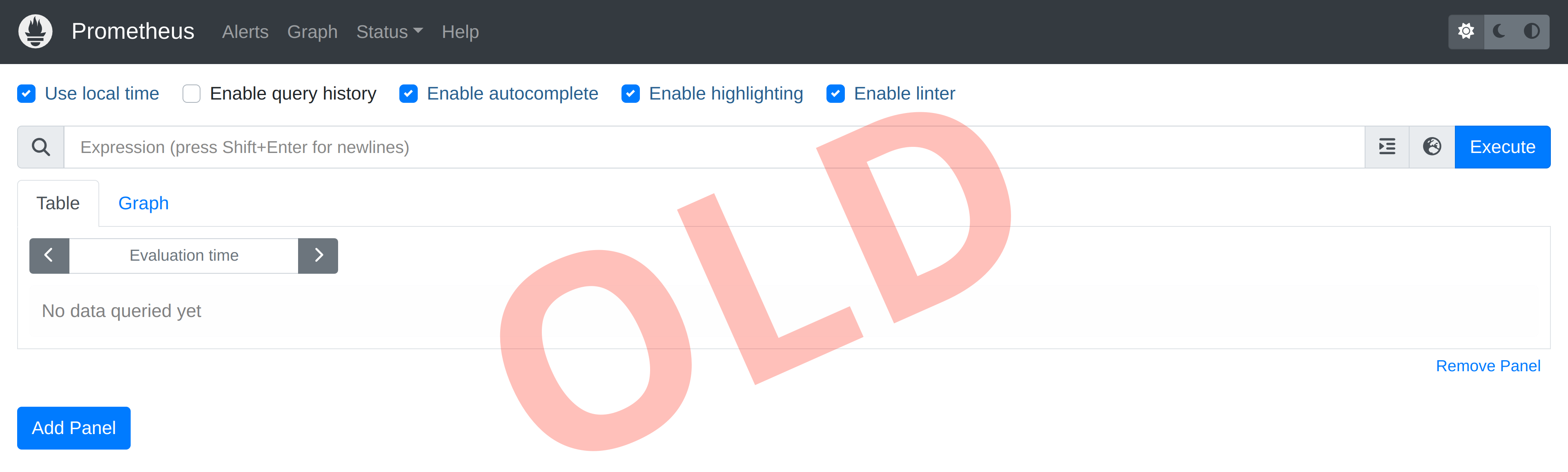
Or at the wild collection of checkboxes at the top of the /graph page – it's not pretty:
Tech-wise, the old UI had also become quite dated under the hood, making maintenance and the addition of significant new features more challenging.
When the Prometheus Team decided to work towards a Prometheus 3.0 release, I knew I couldn't let that happen with the existing UI. We needed something more shiny for the occasion!
So the new UI is a complete rewrite (with some code adapted from the old UI), with the main goals being:
- Reducing the visual clutter that has accumulated over the years by rethinking and cleaning up the layout of each page.
- Creating a more modern look and feel using the React-based Mantine UI component framework instead of the dated Bootstrap-based styles.
- Adding a few major features, like a PromLens-style tree view, query explanation tab, and metrics and labels explorer.
- Enabling better future development and maintenance by using a more modern tech stack and patterns under the hood.
While the new UI adds a few new features, the idea here was not to build anything drastically different, like a full dashboard builder. Prometheus still leaves that area to tools such as Grafana or Perses.
General remarks on the new UI style
Before jumping into details, let's have a look at the overall look and feel of the new UI.
Face-lifted menu structure
Here's a look at the new menu structure:
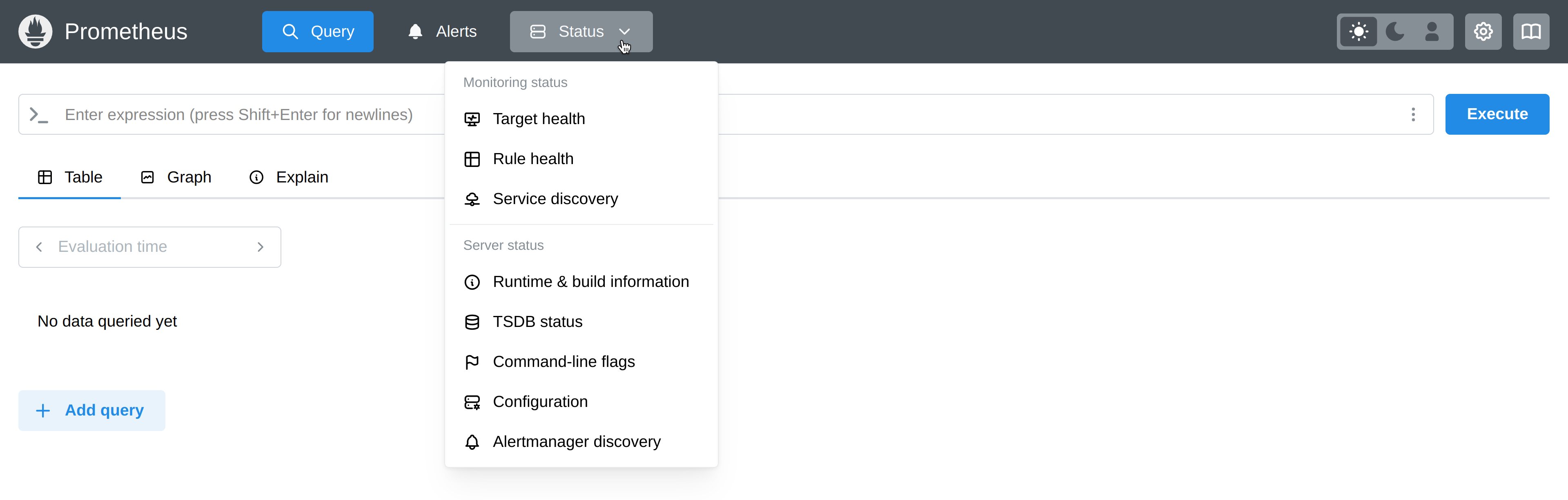
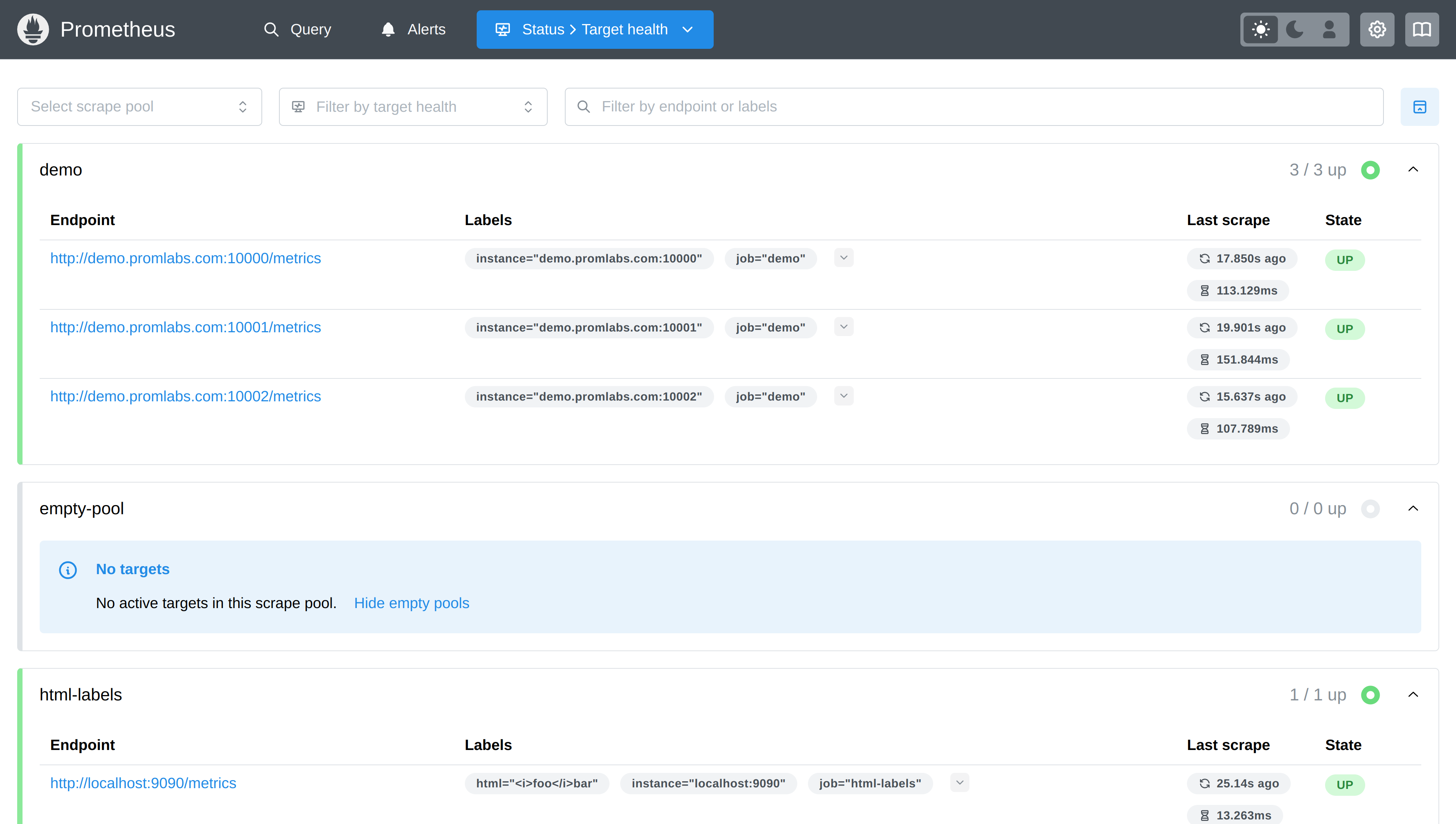
As you can see, most pages still exist as before, with slight renamings and added icons. Most importantly, the "Graph" page has been renamed to "Query", since that just makes much more sense (not every query is graphed). You'll also see that the status menu is segmented and its title will show you which page you're currently on, like in the case of the targets page here:
Less clutter and more consistency across pages
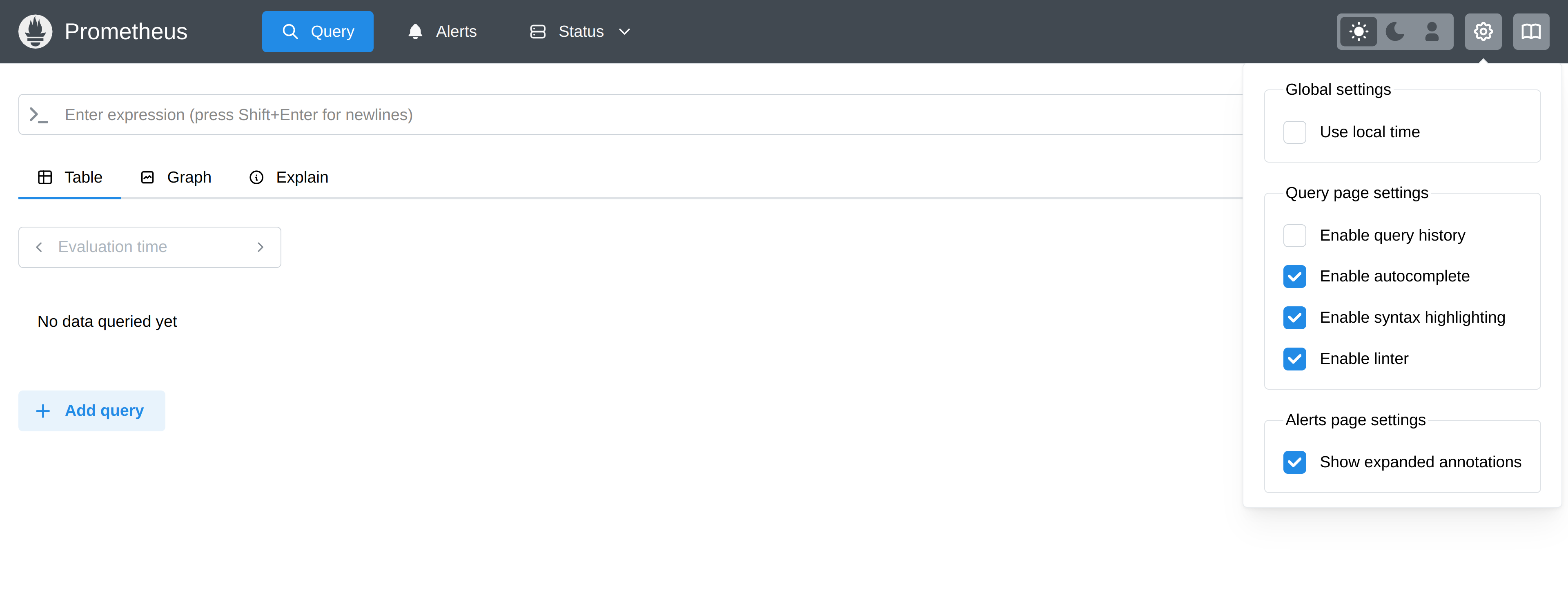
You'll also see less overall clutter and more visual consistency when it comes to panels and filters across pages. Styles and layouts still differ slightly between pages, since they do serve different needs and present different types of data. But I've tried my best to make the differences less jarring. Some rarely needed settings and toggles have been removed from their respective pages, but can still be found in a global settings menu:
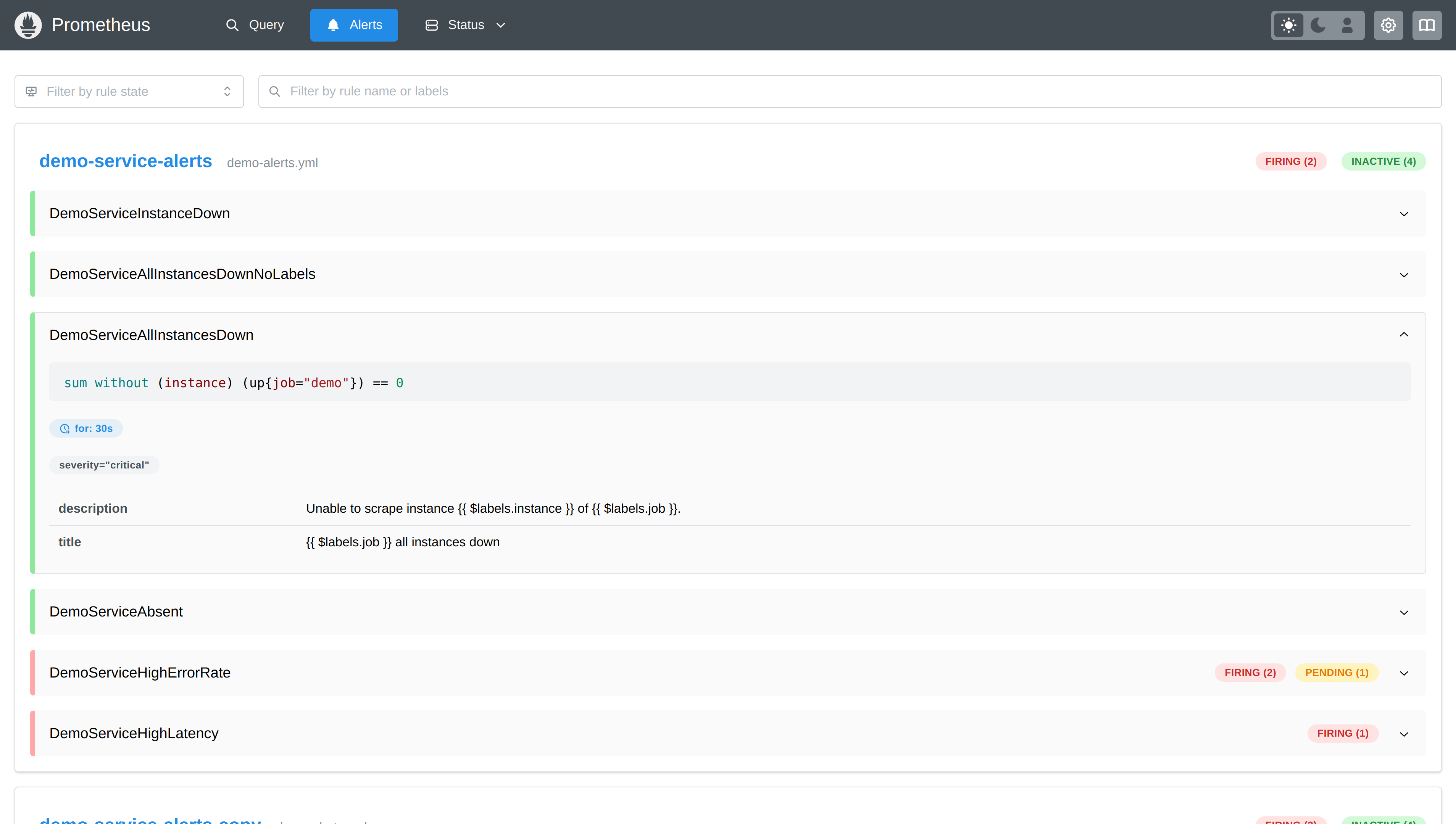
PromQL highlighting outside of the query page
If you look at the alerts or rules pages in the new UI, you will now see the rule PromQL expressions rendered in a syntax-highlighted way, and without trying to render the entire rule as YAML (which was never fully correct in the old UI anyway). Here is an example from the new alerts page:
Light and dark modes
Just as in the old UI, the new UI has light and dark modes that you can switch between with the toggle in the top menu. Hopefully, the new dark mode also looks more appealing now:
Prominent new features
Let's have a look at a few of the most exciting new features of the new UI!
Metrics and labels explorer
Prometheus 3.0 comes with a new metrics explorer that allows you to search all available metrics, along with the known metadata for each metric:
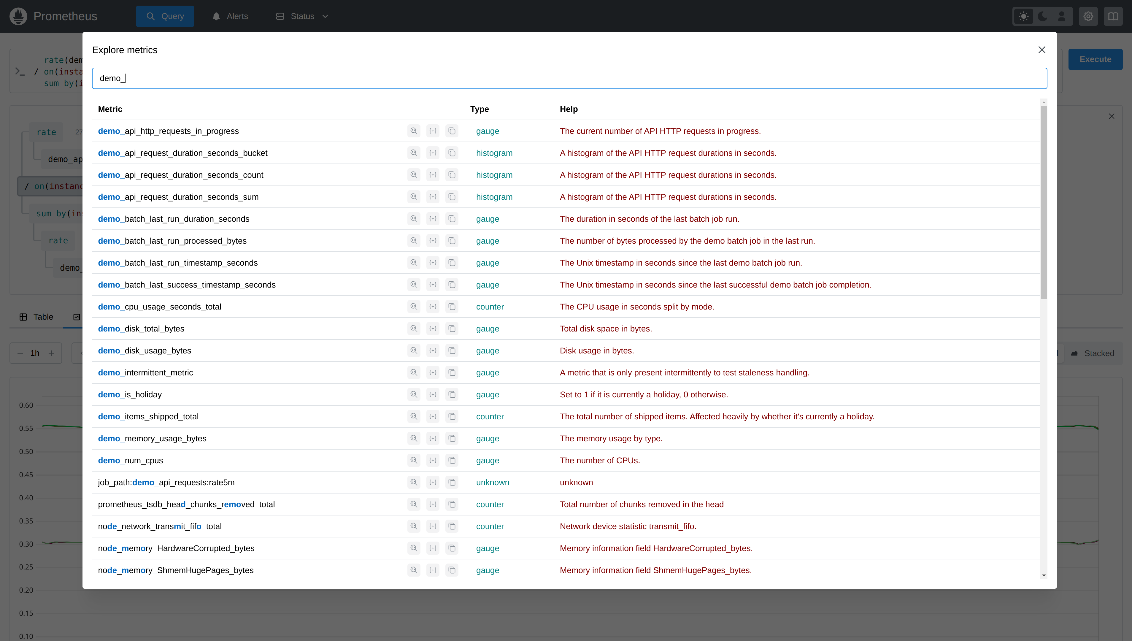
This explorer also allows you to drill down into the label names and values of a specific metric name:
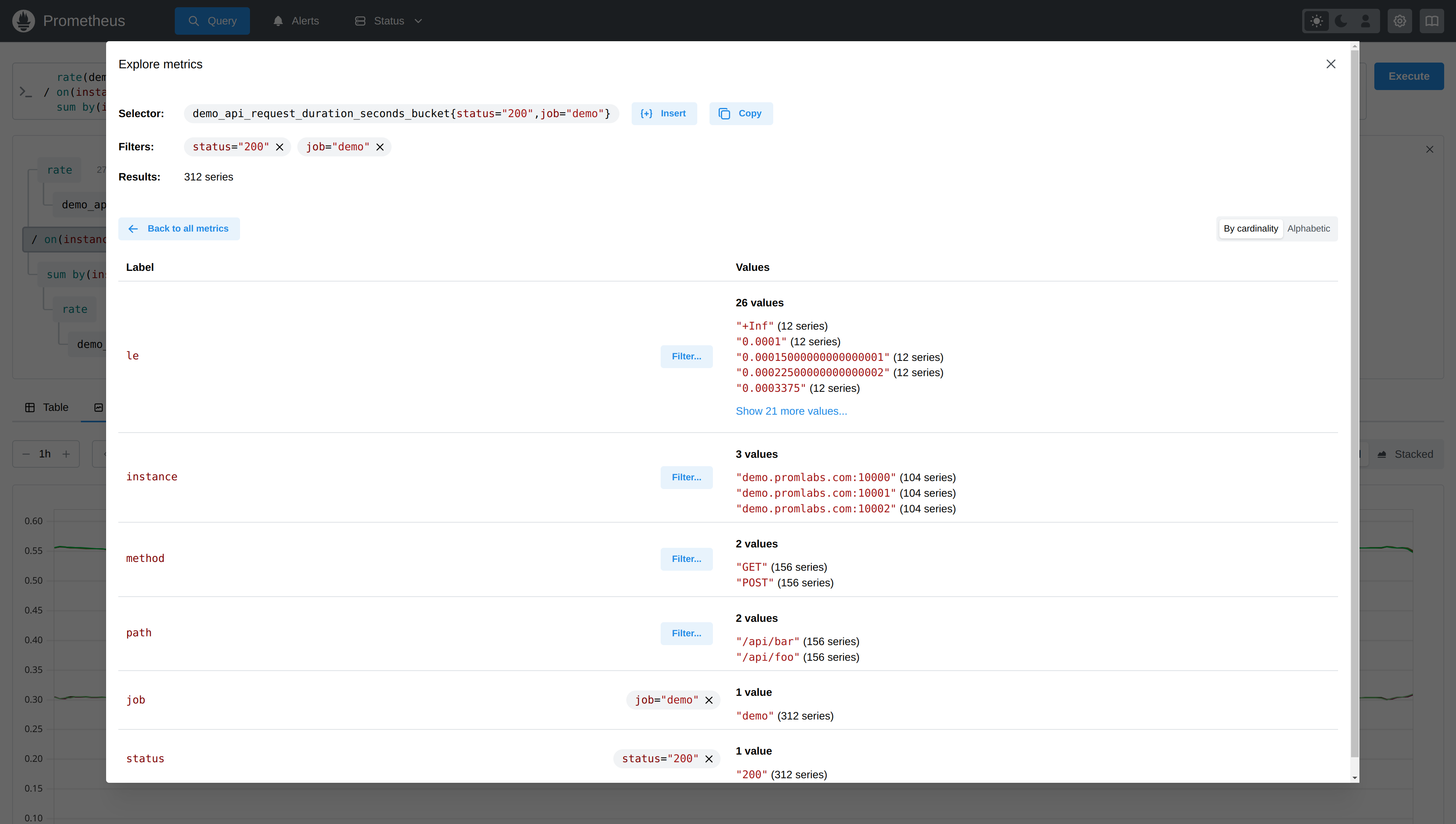
This helps you get a quick idea of the available labels on a metric, their individual cardinality, and the number of series they produce. The labels explorer also allows you to progressively add label matching filters to narrow down the result. Finally, you can then insert the constructed selector into your text input.
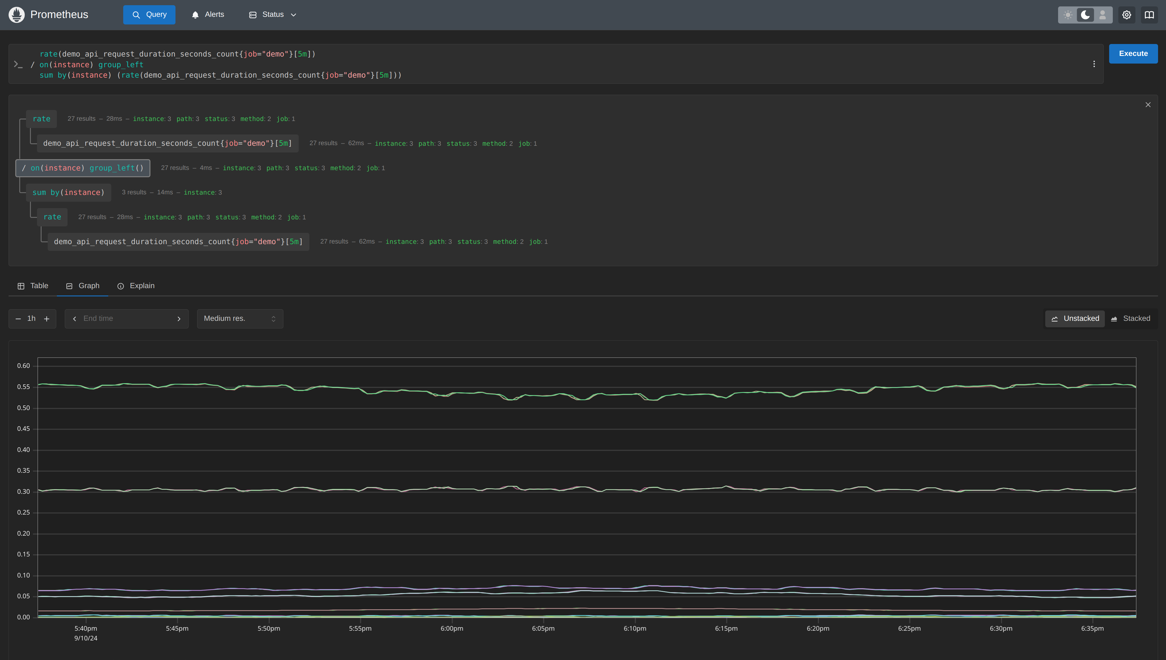
PromLens-style query tree view
Adopted from PromLens, the new UI now allows you to show any PromQL query as a tree of sub-expressions:
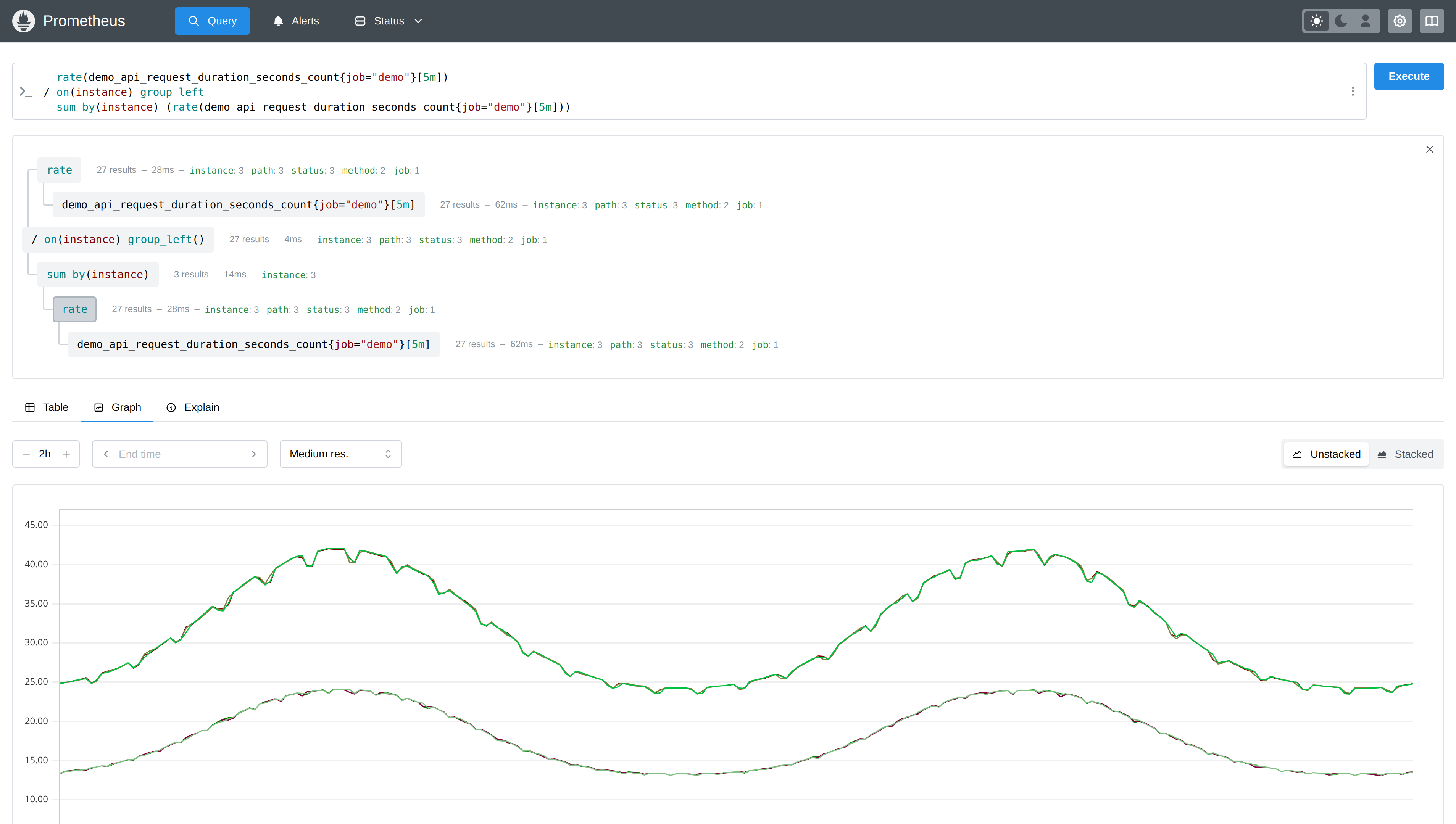
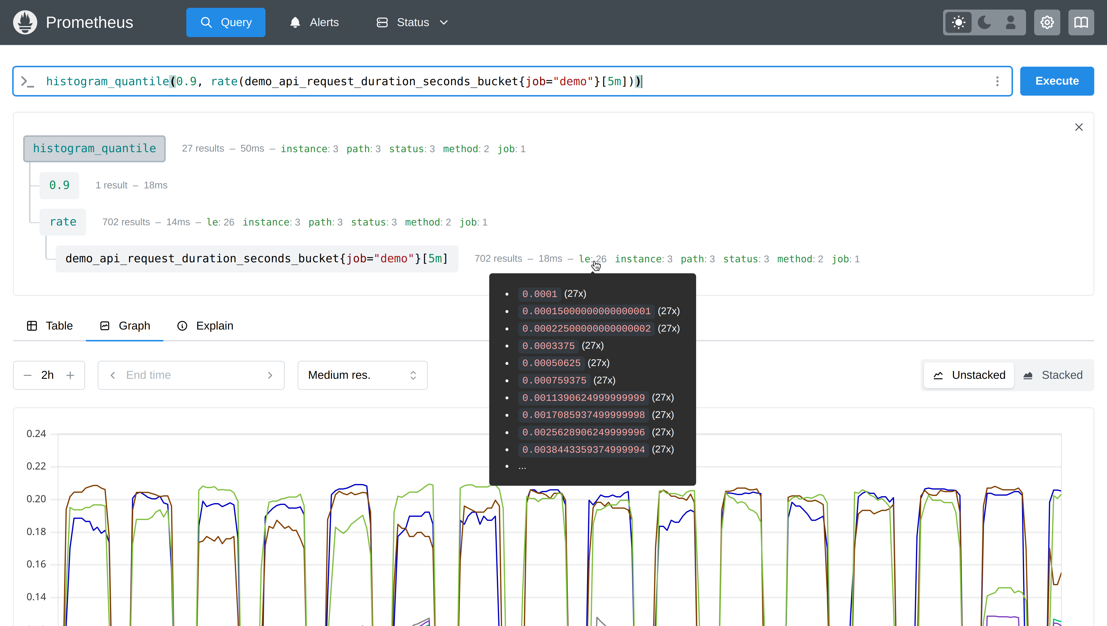
The tree view shows you how many series each node evaluates to and what label data is present in each sub-expression. By hovering over a label name, you can see some of the example label values for it:
You can also click on any tree node to see its full data as a table or graph.
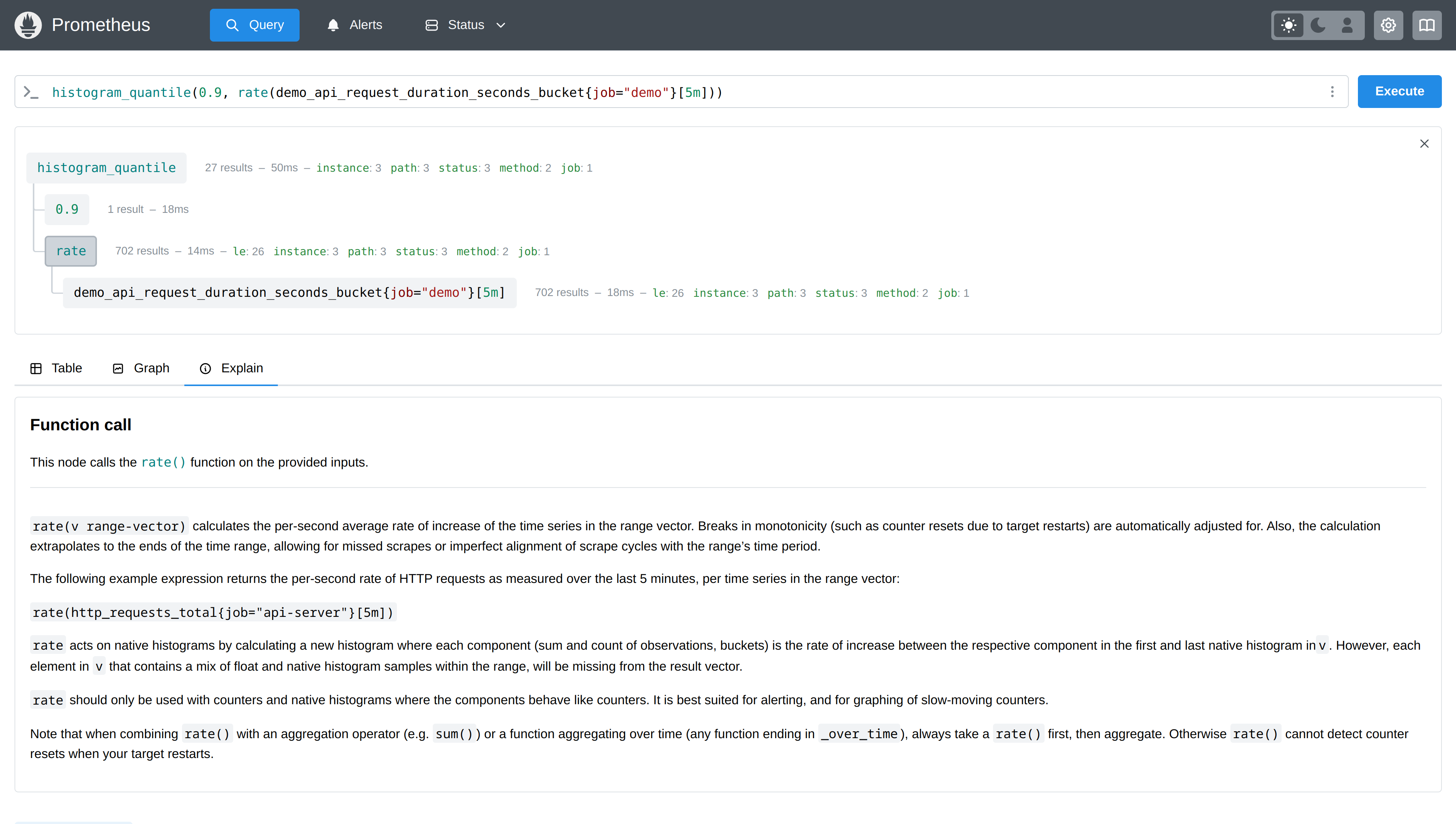
"Explain" tab to explain and visualize query behavior
In conjunction with the tree view, a new "Explain" tab will now give you useful explanations and behavioral insights for any selected tree node. For example, clicking on a function call will show you the documentation for that function:
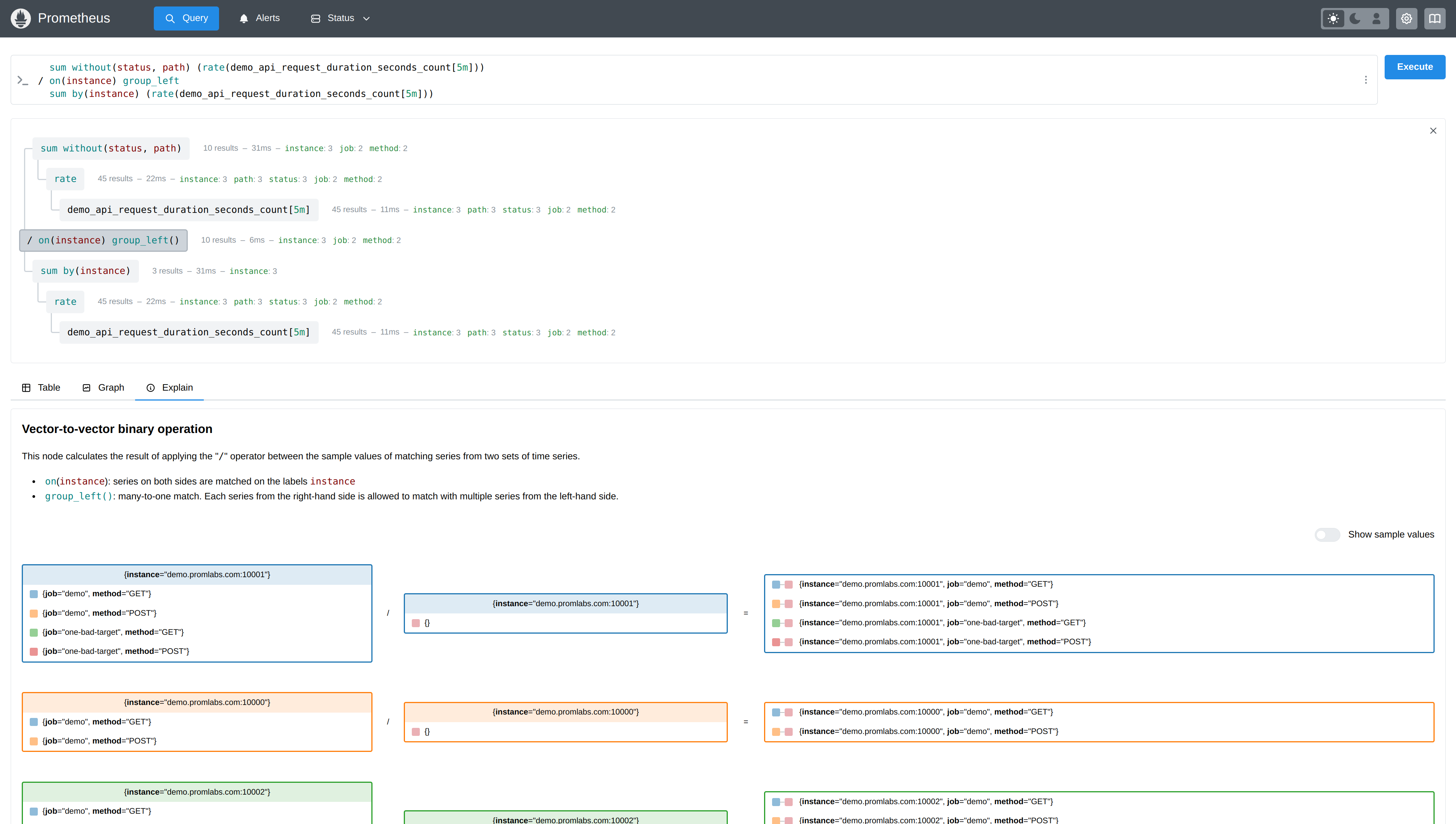
But the "Explain" tab is especially useful for understanding and debugging vector matching behavior in a binary operator between two vectors. For example, here you can see a successful many-to-one vector matching being illustrated between two input vectors:
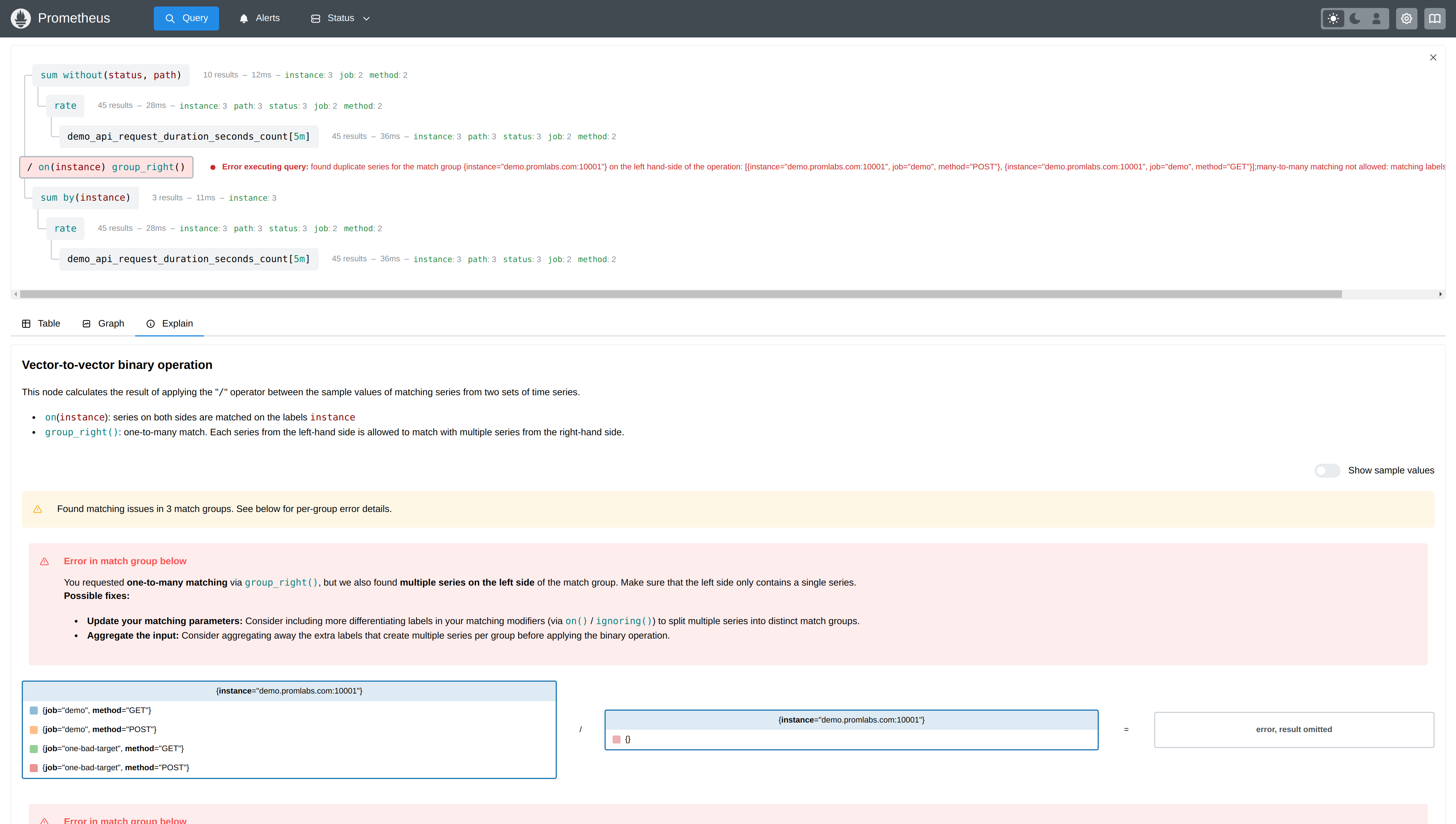
And here you see an erroneous vector matching attempt, along with explanations and visualizations of what is going wrong:
I hope that these new features reduce the pain and bring more joy into people's PromQL building experiences.
Feature-completeness, stability, and switching back
While the new UI brings many new benefits, there are still a few minor missing features in the new UI that we plan to add over time. The two most prominent ones are:
- Displaying histograms as heatmaps.
- Displaying exemplars in the graph view.
Both of these features are unfortunately more tricky to implement using the new uPlot charting library, which replaces the outdated and largely unmaintained Flot charting library of the old UI.
In case you rely on these specific features or you run into any other issues with the new UI, you can still switch back to the old UI for the time being by using the old-ui feature flag:
./prometheus --enable-feature=old-ui [...]Since the new UI is not battle-tested yet, it is also very possible that you will still run into bugs or performance issues. If you do, please report them on GitHub so I can take a look.
Try it!
To try out the new UI, you can of course install the Prometheus 3.0 beta release right now, but if you just want to play around with the new UI without having to set anything up, take a look at this temporary demo Prometheus 3.0 server.
Conclusion
As explained above, the new UI in Prometheus 3.0 doesn't only give users a more modern and clean experience, but also adds valuable new features around PromQL query building and understanding. I hope that you enjoy the new interface, and I am looking forward to improving it over time!
Comments powered by Talkyard.